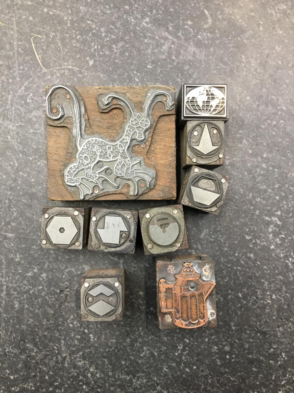
Had fun with eBay recently, got some new blocks and cuts, and also stumbled upon a lead type fire sale. I don’t have pictures of the type yet, but I’ll post some when I do. Here are some of the cuts I got.
Boston-Based Printing & Instruction in the Antique Art of Letterpress
Had fun with eBay recently, got some new blocks and cuts, and also stumbled upon a lead type fire sale. I don’t have pictures of the type yet, but I’ll post some when I do. Here are some of the cuts I got.
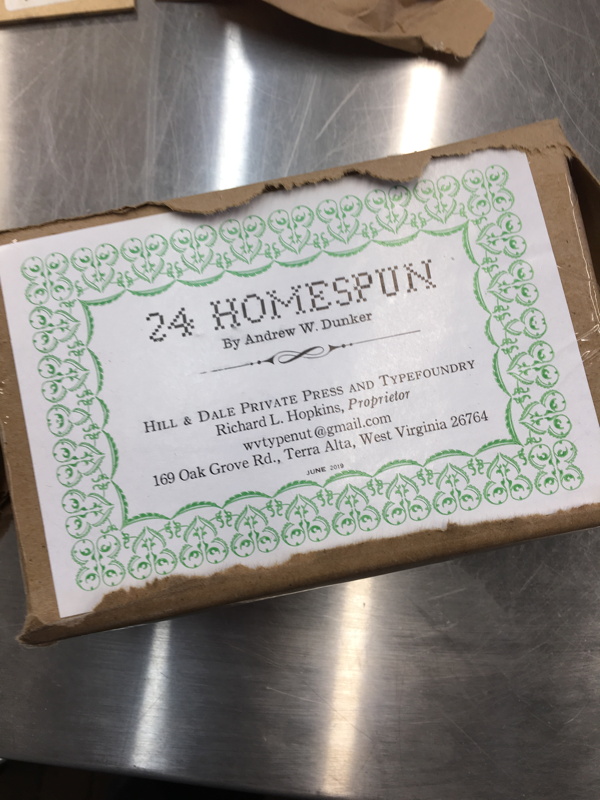
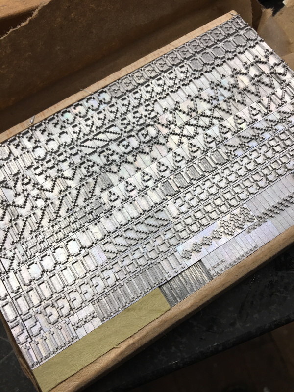
Got in a surprise new typeface over last weekend. It’s a face designed by an engineer in a pixelated form intended to mimic the designs of needlepoint sampler alphabets. As I’ve don some exploration of the intersection of digital and analog pixellation in my art practice, this was something I had to get. This was a limited casting done by Hill & Dale Private Press in West Virginia.
Just a couple of pics from the last week… An action shot of distributing the new 8, 10 and 12pt Bernhard Modern, and a dynamic arty shot of my new APA bundle print.
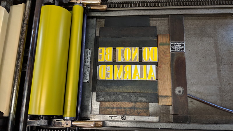
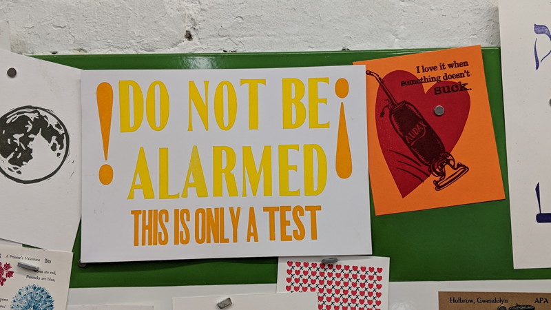
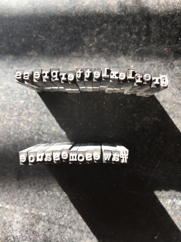
Last weekend Chris Fritton, the Itinerant Printer, stopped by for a demo while in the Boston area. He printed a type-interaction piece and talked about his work and travels with the folks that came out to see him. Pictures below!
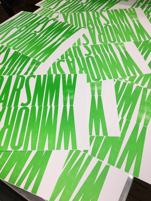
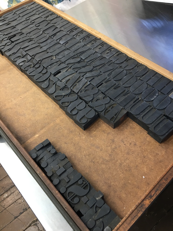
One of my renters, Gwen Holbrow, has been working on creating her own home-brew woodtype with various fun technological toys. Here’s a summation of her project:
[T]oday I tested my homemade type, and it printed great. I’m quite pleased. I made some 12 pica Modified Gothic XX Condensed, pretty much identical to your wood type labeled Semi Serif. The material (Sintra on an MDF base) is too soft, though, and dents very easily. But I have proof of concept. It feels like a new superpower. Now I just need endgrain maple…
When asked for more details, she gladly expanded on the process:
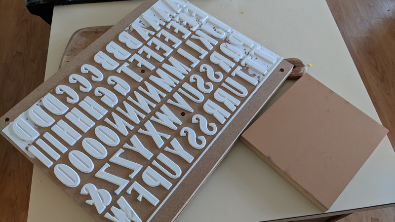
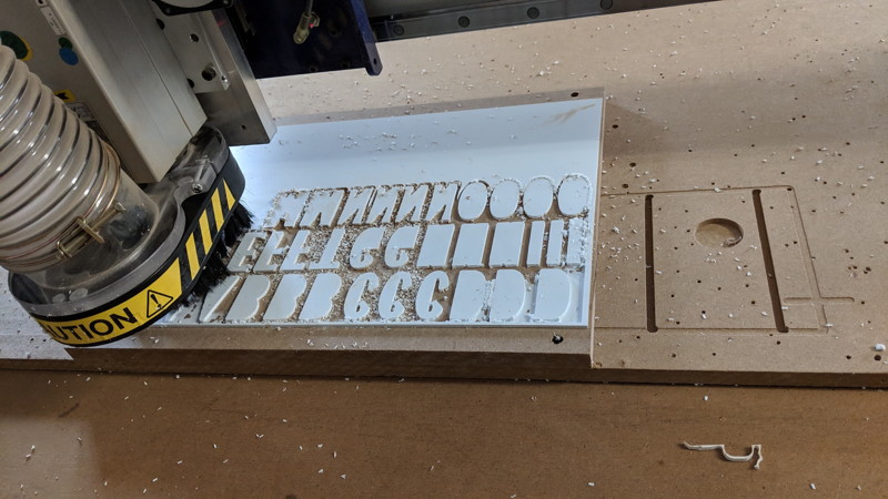
I used a scanned version of the proof page from Rob Roy Kelly’s wood type book, traced and expanded it in Illustrator, cleaned that up a little (more would have been better), imported the vectors into Vcarve to create a toolpath, carved it on a ShopBot CNC router and cut the letters apart on a table saw and chop saw by eyeball. Oh, and I also used the CNC router to plane down the 3/4″ MDF a little and then glued 1/8″ plywood to one side and Sintra to the other to try to get the total to .918. It ended up higher, and not super even, but the material is soft enough so that it worked. It took the machine between five and six hours to carve the letters, the chips stuck to the Sintra and needed hours more of hand removal at the end, and there are a lot of things I would do differently another time. But I did get something printable, which is pretty cool! And the process should work with hardwood if I can get some. I was thinking of making some fatface next, I love those, but since you have that Bodoni Ultra, I don’t have to! But I could probably produce a few matching letters if needed. And now I understand why new wood type is so expensive.
Eventually, if I get to a better product, I might sell some, and I’m going to try lino next. Can you perhaps ask if anyone knows any arborists or lumber people who would sell rough cross-section slices of maple or fruitwood trunks or branches, 1-2″ thick? Even firewood could work if it’s not split small, and I could slice that myself. The tree places I’ve called so far only save oak and pine, and send the maple and wild cherry through the chipper! Plus they clearly think I’m crazy. 🙂
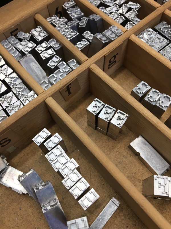
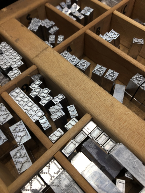
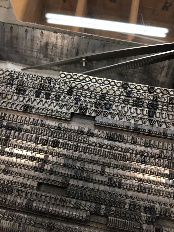
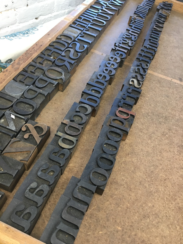
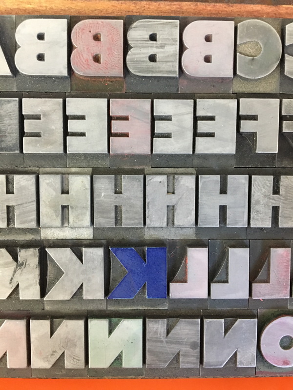
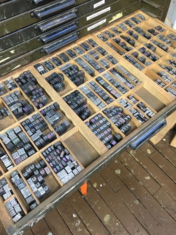
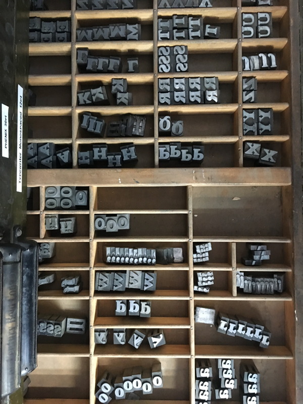
Finally had the time and job cases to distribute all the type I’d gotten in over the last couple months. Here are some shots of the faces and process. The new type includes:
Goudy Heavyface 48pt
Century Schoolbook Italic 18pt
Typewriter 12pt (monospaced)
Airport Black 48pt
Airport Black 36pt
Airport Black 30pt
Airport Black 24pt
Bodoni Extra Bold Condensed (wood)
DeVinne (wood)
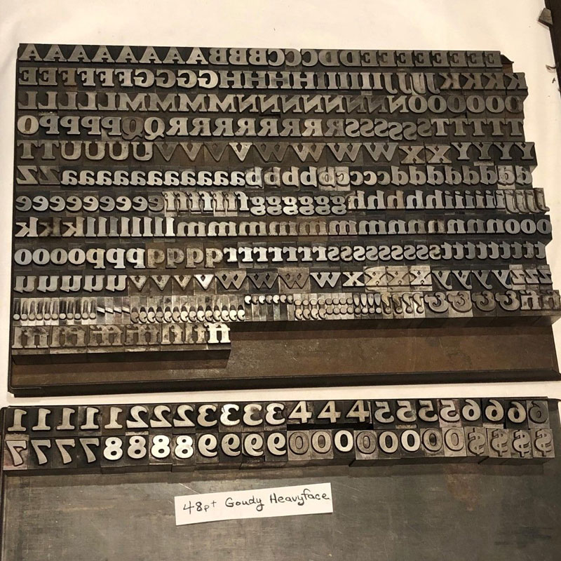
I probably have too much metal type in the library now, but this particular chunk of lead was available for a steal, so I decided to jump on it. It’s Goudy Heavyface, a nice black titling font. Incidentally, I’ve always wondered how Goudy pronounced his name, so I looked it up: it’s “Goudy” with the “ou” pronounced as in “out”. The more you know!
Of course, there are plenty of people out there for whom the phrase “too much type” does not actually parse as a valid English sentence.
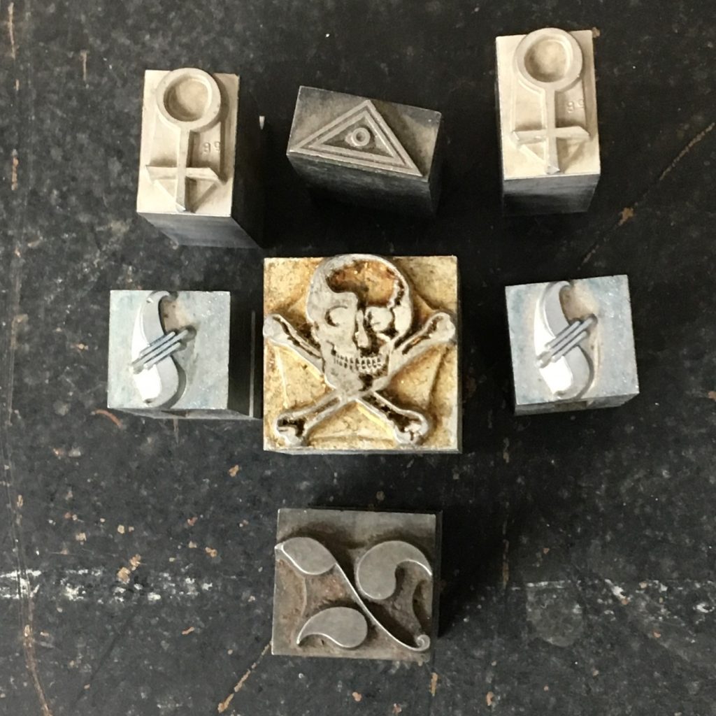
Got more ornaments in, got more tympans in, got more Airport Black in. Lots of stuff came in over the holidays! Once nice thing, a skull and crossbones ornament suitable for your piratical printing needs
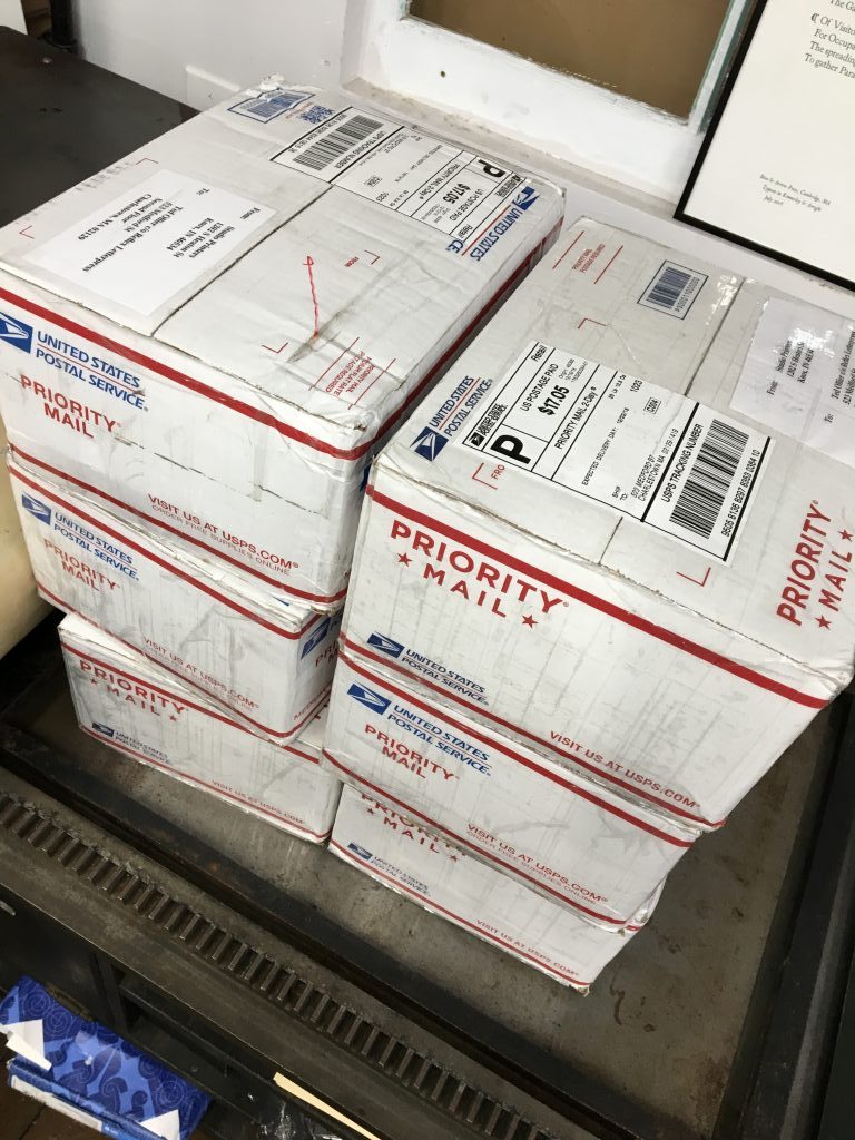
Next on the agenda — finding cases to put 40 pounds of Airport Black in various sizes. Here’s all the boxes it took to get it to me:
In the next couple weeks I’ll be putting up shelves and rearranging a bit to see if we can squeeze everything plus the Golding Jobber 7 into a more harmonious arrangement!
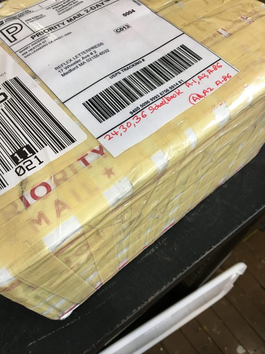
This week I found a lot of Century Schoolbook up on eBay for a good price; after discussing things with the seller, I got even more Century Schoolbook for a better price. Here’s the first (very heavy) box of new-to-me type!
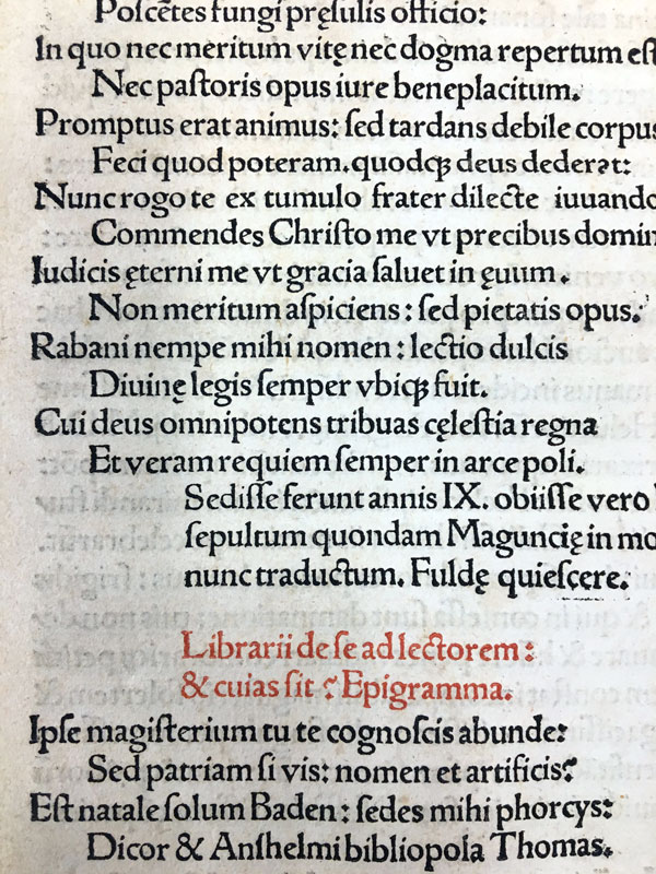
A couple weeks ago I took my students to the Houghton Library at Harvard to show them samples of letterpress incunables. I saw this example of exquisite letter design by Aldus Manutius from around 1510 and had to share. Those ligatures just slay me.