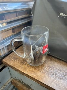
I’m a tea guy, not a coffee guy, and ever since I quit Diet Coke six years ago I’ve been drinking gallons of the brown joy per day. There was a large, weighty glass mug kicking around the studio when I started at the Stove Factory, and it became my go-to for tea consumption. It’s got a good feel, good presence, and holds 20oz. What’s not to love?
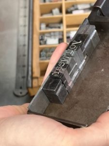
The original glass met an untimely demise at the hands of a case of type a while back, and I accidentally found a (single) replacement at a local restaurant supply store during the pandemic. Since I’d already lost one, I was worried about the longevity of the replacement, and wanted backups. They didn’t know when they’d get more in, but I figured I’d just keep checking. No dice. Searching for “large glass mug” on Google is a fool’s errand, but reverse image search actually worked after I took a shot of the glass against a white background. Turns out this is a 20 oz Haworth Glass Beer Stein, and is no longer in production. HORRORS!
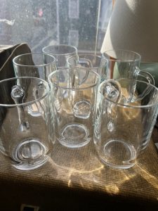
Enter eBay. I’ve found that eBay is the place where discontinued, obscure and weird consumer commodities go to find their Forever Homes, and this was no exception. I had to get them from England, but seven Haworth Glass Beer Steins arrived safe and sound. Whew! [sigh of relief]