I’ll keep the suspense somewhat heightened, so I’ll just put this here:
Boston-Based Printing & Instruction in the Antique Art of Letterpress
I’ll keep the suspense somewhat heightened, so I’ll just put this here:
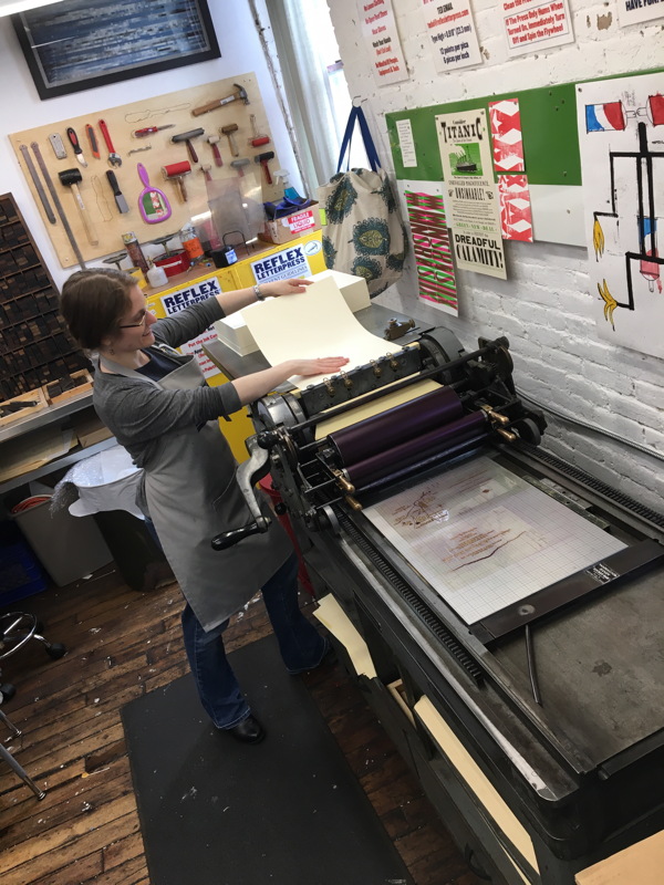
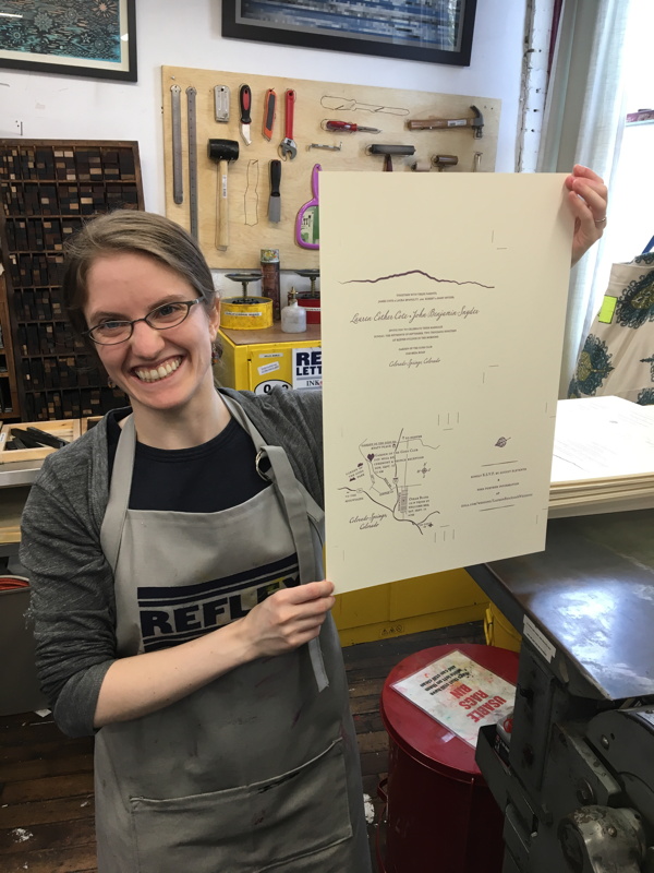
An old regular from the Bow & Arrow brought in a friend who was looking to print her own wedding invitations. Great fun was had by all!
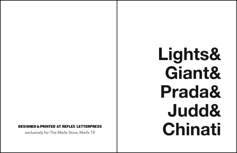
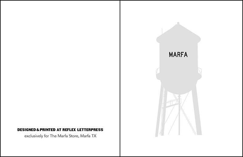
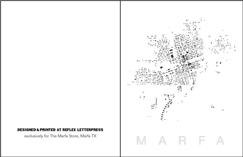
I’m working with the gallery inde | jacobs in their new venture The Marfa Store to create cards and images based on the iconic West Texas town, home of magical lights, the movie Giant, and the conceptual artist Donald Judd. I’ll be finishing up the foldeover A2 cards and postcards this weekend, for the big opening at the end of June. Here are three samples for your perusement.
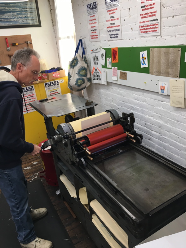
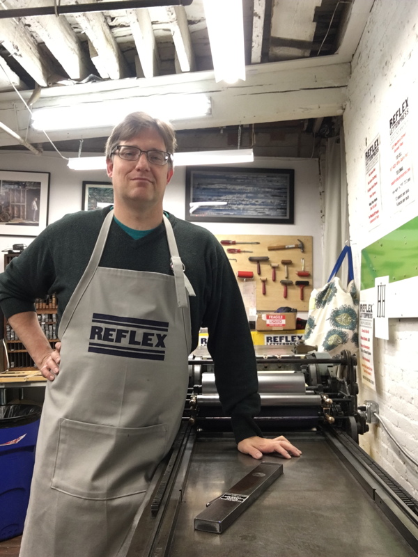
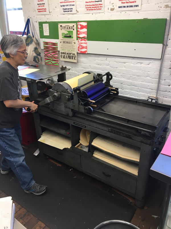
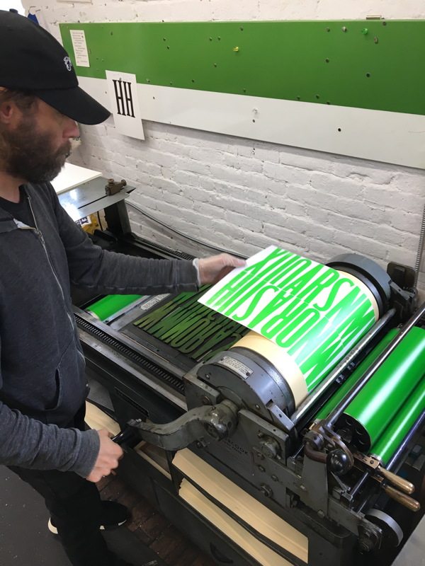
Nothing too exciting this week, here are some shots of the Press from the last couple of classes.
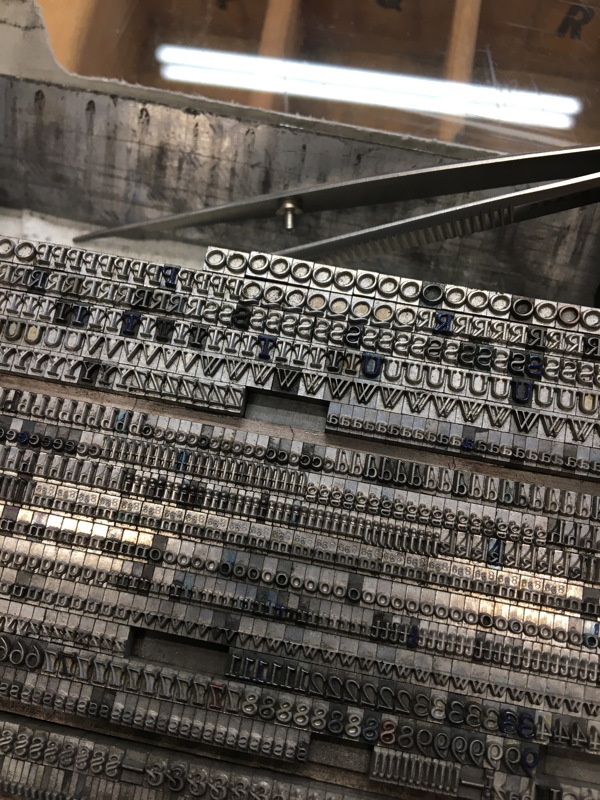
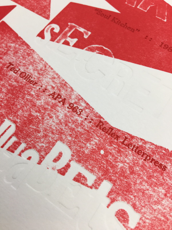
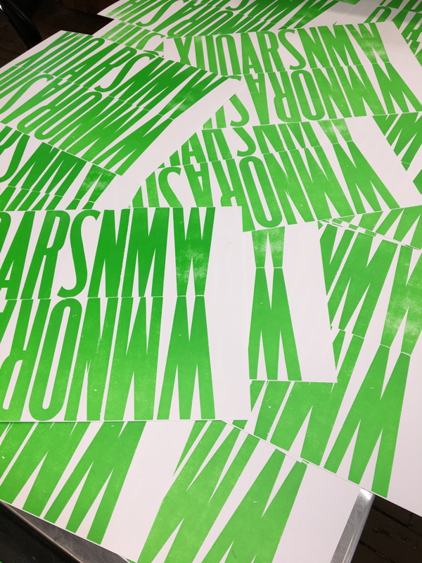
Just a couple of pics from the last week… An action shot of distributing the new 8, 10 and 12pt Bernhard Modern, and a dynamic arty shot of my new APA bundle print.
Last weekend Chris Fritton, the Itinerant Printer, stopped by for a demo while in the Boston area. He printed a type-interaction piece and talked about his work and travels with the folks that came out to see him. Pictures below!
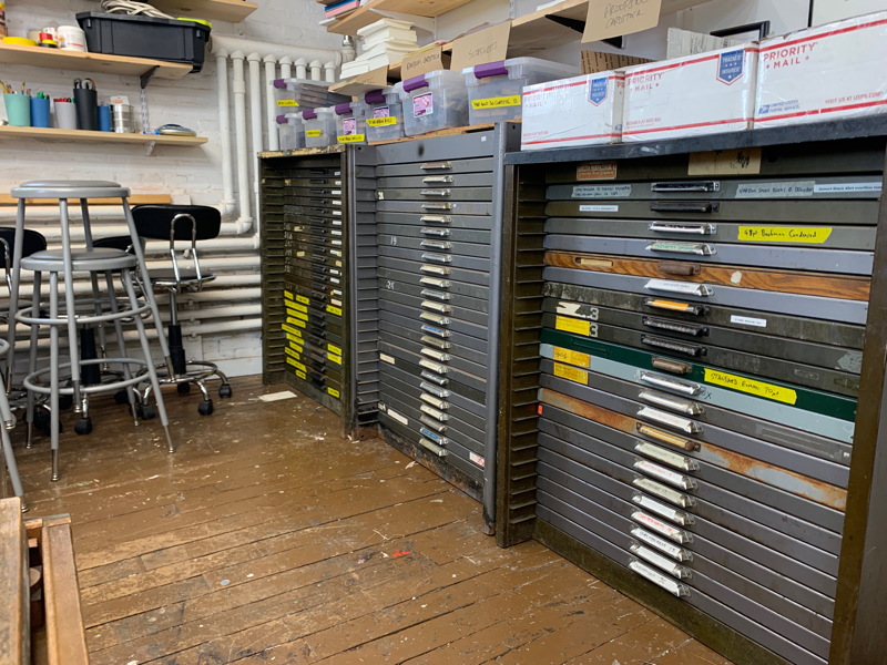
I finally bit the bullet and got yet another type cabinet with included California type cases. I think this will finally get a handle on the wood type cases that are floating around the shop and all the wood type that’s still stored in Tupperwares.
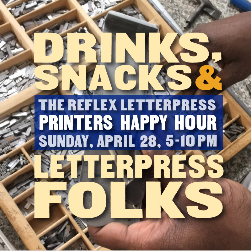
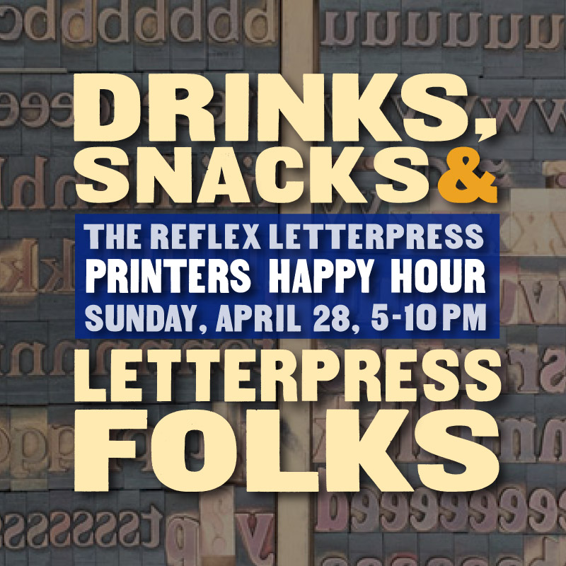
Don’t forget, the Printers Happy Hour is in ten days!
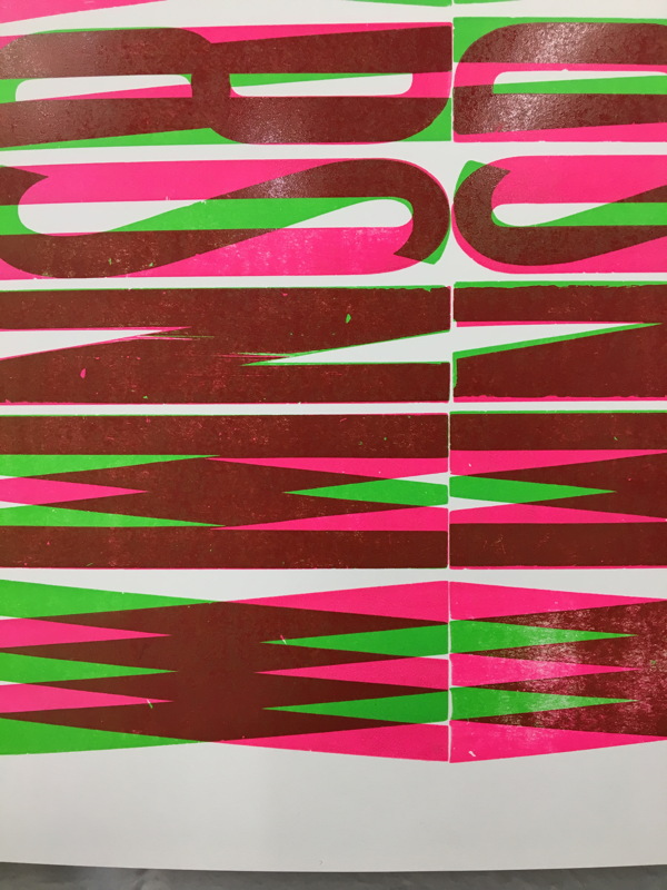
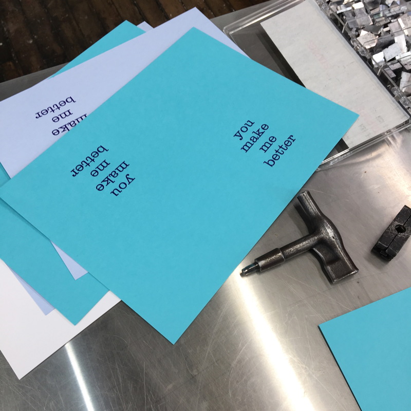
A quick shot of a class project from the weekend:
And a reminder that the Reflex Letterpress Happy Hour is coming up!
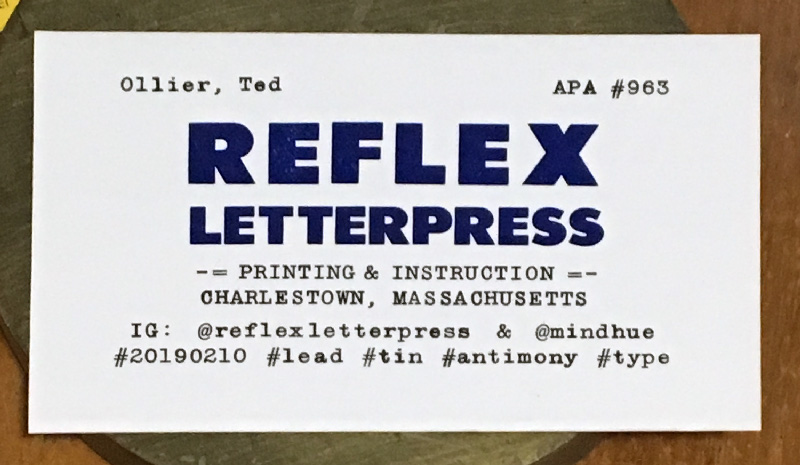
I’m not sure how many people actually read the news blog, so I feel safe that posting my APA prop card here won’t be too much of a spoiler. Gonna mail them off this weekend.
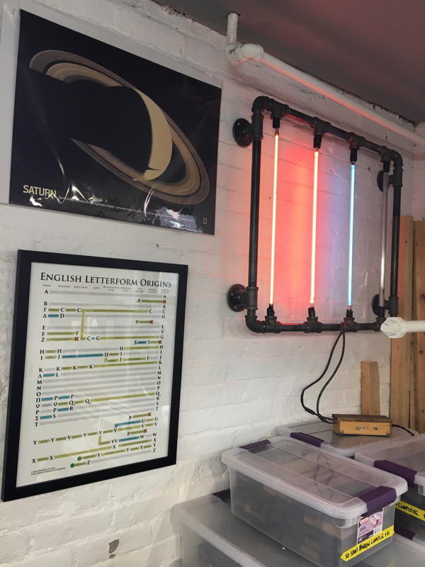
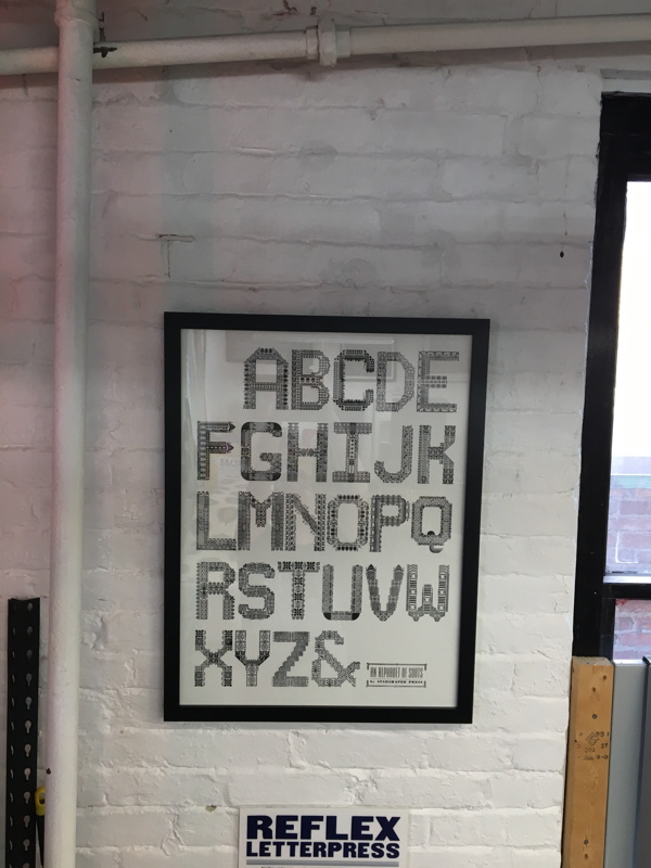
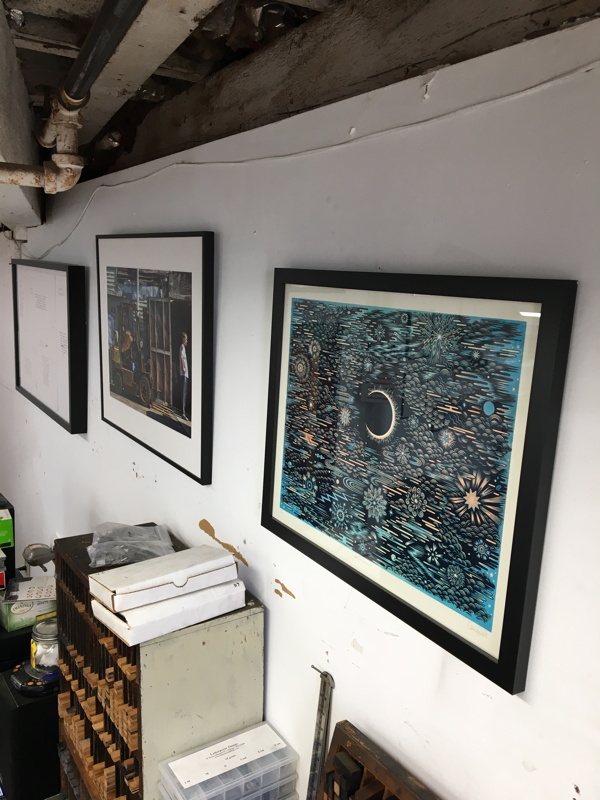
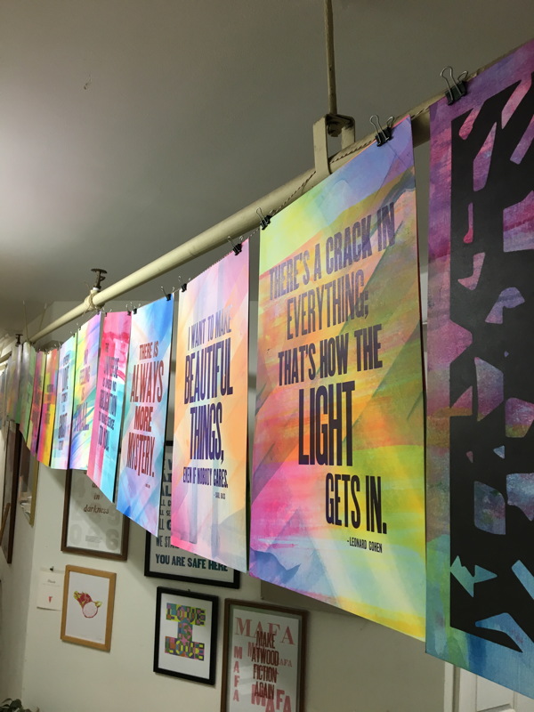
Classes are going great, people are waking up from the winter, and I may get more type in soon. The space has been evolving, with some artwork up on the walls from Tugboat Printshop, Starshaped Press, and Mindhue Studio. I figured I’d do a more environmental post this week, so you can see the space.